Tuesday, 27 December 2016

Compare and Contrast of a Double Page Spread


Compare and contrast of a double page spread from Hannah Ould

Here I have compared by Double Page Spread with an existing one and have identified what I need to do in my next draft to make it better.

Compare and Contrast of a Contents Page


Compare and contrast contents page from Hannah Ould

Here I have compared my contents page with an existing one, Shout Magazine. This will help me know what to change/alter for my next draft.

Wednesday, 14 December 2016

First Draft of Double Page Spread

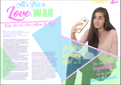
Here is my completed first draft of my double page spread. I have added a bottom banner with information in underneath the article with some vague information in - like one of the Top of the Pops double page spreads. For my next draft I will either change my dominant image or edit it better as I am aware that it looks a bit grainy/not as professional as the rest of the double page spread. I may, also, change the background so that there is not as much blank space behind my dominant image. Overall, I am quite pleased with my first draft of my double page spread.

Draft of Double Page Spread


From last time I have added two sub images to the front cover with captions and photo credits. I have, also, added an article credit and a dominant image credit. I, also, decided to add some yellow to the space behind the article title but I was not sure whether the yellow made the page look a bit garish or not. In the end I have decided that I do like the yellow and that I will keep it as I think that it looks bare without it.

14th December 2016

Start of Lesson

In this lesson I will be aiming to finish my first draft of my double page spread.

End of Lesson

In this lesson I have completed my first draft of my double page spread and I have identified what I need to change for next time.

Monday, 12 December 2016

Draft of Double Page Spread


12th December 2016

Start of Lesson

In this lesson, I will be continuing to create my first draft of my double page spread.

End of Lesson 

In this lesson, I have continued creating my double page spread.

Wednesday, 7 December 2016

Draft of a Double Page Spread

Here is my current draft of my Double Page Spread. I need to change/edit the image as it is a bit grainy. I have finished the article and have added a pull quote as well as some coloured triangles to add colour to the page.

7th December 2016

Start of Lesson

In this lesson I will be continuing to work on my Double Page Spread.

End of Lesson

In this lesson I have continued my Double Page Spread.

Monday, 5 December 2016

Draft of Double Page Spread

Here is my current draft of my Double Page Spread. I still need to finish typing up the rest of the article and add my images to the page. There are a few more things I need to do like add captions and an anchor, etc.

Flat Plan for Double Page Spread


Flat plan for double page spread from Hannah Ould

Rationale


My double page spread will have the article title at the top of the left hand page with a strap line underneath it. Underneath the article title will be the actual article. At the beginning of the article will be an intro/kicker with a drop cap at the start. Above the second column of the article will be two sub images. Each image will have a caption. The dominant image will take up the entire right hand page and above it will be a slug and a running head. There will be an anchor in this bottom right hand corner. There will be a byline underneath the anchor and dominant image. In the bottom left hand corner and the bottom right hand corner of the double page spread there will be page numbers. I was inspired by 'Top of the Pops', 'We Love Pop' and 'Teen Vogue'.The colour scheme will be the same as my contents page and the fonts will, also, be similar. The article title will be 'All's Fair in Love & War' - which will be written in three different fonts. 'All's Fair in' will be written in 'Olympic Branding from dafont.com, in light blue; 'Love' will be written in 'Thinking of Betty' from dafont.com in pink; '&' will be written in 'Bringshoot' from dafont.com in the same blue as 'All's Fair in'; 'War' will be written in 'Hollywood' in a lime green colour. The '&' will be smaller than 'Love' and 'War' so that they will instantly grab the audience’s attention and entice them to read the article. The 'Love' and 'War' will be in two different colours to show that they juxtapose each other.The strapline will say something like 'Boys, Love and a New Album. Oh My!' - this would be a reference to the Wizard of Oz quote "Lions and Tigers and Bears. Oh my!" This will be written in 'Olympic Branding', like some of the article title, and will be written in pink - as pink is a stereotypically girly colour.The article and intro/kicker will both be written in 'American Typewriter' in purple. The intro/kicker, however, will be written in a lighter purple than the rest of the article to make clear that this is the intro and not apart of the actual article. As well as this, it will be written in a slightly bigger font.I will have the anchor as a pull quote from the article - the part of the article with this quote in will be written in pink to draw it to the audience's attention. The anchor will be written in both 'Bringshoot' and 'Thinking of Betty' - so that it has a similar look to the article title. Key words from the pull quote will be written in different colours from the rest of the quote - likely to be pink and blue.The two sub images will be pictures taken from the models social media account (at least according to the article). They will likely be of the model and with someone else, who is mentioned in the article. Each sub images will have a caption, explaining what is happening in the image/who is in the image.The dominant image will be of my model, with a casual pose and a 'Chocolate Box' facial expression to show a fun side of the model and to try to convince the audience to read the article. My model will be wearing casual, girly clothes in pink and other girly colours. She will be wearing makeup but not too much and her hair will be quite natural - possibly curled. The image will be a full shot of her body and will be at eye-level so that she can make eye contact with the audience - to form a direct mode of address with them.The running head will contain a box with 'Article' written in - as is featured in 'Top of the Pops' articles. The box will be a light yellow and the font will be a bolder 'American Typewriter' in pink.The page numbers at the bottom of the page will be a similar style to the running head but the font won't be bold it will be normal.For language and register, I will be using a lot of internet slang and language that the target audience would use so that they can relate to the magazine and will identify with it. I will use abbreviations like OMG, BTW and TBH so that when the audience read it they will feel included as the article is catered towards them. The use of slang and abbreviations will make the audience feel like this is a language only they can understand, giving the magazine a sense of personality and privacy from other people.The dominant image is of the model leaning against a tree and looking into the distance. The lighting is natural lighting as it makes the whole magazine seem more authentic and the model seem more down-to-earth. The image is taken at eye-level as it shows that the model sees her fans as friends rather than fans – they are not beneath her. The fact that she will be looking to her left shows that she is reflecting on her past and draws the attention of the audience to the article. Due to the fact that she is leaning against a tree will imply that she can lean on her friends for support should she need to – as friendship is an important part of the article.

Source Existing Magazine Double Page Spreads


Source inspiration for double page spread from Hannah Ould

Here are the magazines that I have chosen to be the inspiration for my double page spread. I have chosen: 'Top of the Pops', 'Teen Vogue' and 'We Love Pop'. I have chosen 'Top of the Pops' because I like the layout and the different fonts. I have chosen 'Teen Vogue' because I like the layout. I have chosen 'We Love Pop' because I like the layout and the framing of the double page spread. I hope to incorporate elements from all three of these magazines in my own double page spread.

5th December 2016

Start of Lesson

In this lesson, I will be sourcing my inspiration for my double page spread and making a flat plan for my own double page spread. I will, also, be starting my double page spread.

End of Lesson

In this lesson, I have sourced my inspiration for my double page spread and made a flat plan for my own double page spread. I have, also, started creating my double page spread.

Wednesday, 30 November 2016

Feedback Interview for Contents Page

From this interview I know what would be best to change about my contents page and what to keep the same. The fonts and colour scheme work well but I need to fill some of the blank space next to my dominant image.

Contents Page Feedback

From this I know that I need to change either the colour of the box or the font colour of the subscription box so that it's easier to read. I, also, need to fill some of the blank space and possibly add a colour to the background, however, I think that I prefer it white.

Draft of Contents Page

Here is my current draft of my Contents Page. I still need to fill some blank space and maybe adjust some font colours.

Draft of Front Cover

Here is my second draft of my Front Cover. I still need to change the pictures for the snapchat filters as they currently do not work with the rest of the magazine.

30th November 2016

Start of Lesson

In this lesson I will be adding the finishing touches to my contents page and second draft of my front cover. As well as this my contents page will be peer assessed and I will compare and contrast my contents page to an existing contents page. I will, also, interview somebody about my contents page.

End of Lesson

In this lesson, I have added the finishing touches to the contents page and front cover of my magazine. People have, also, peer assessed my contents page and I have identified what I will change next time.

Monday, 28 November 2016

Draft of Front Cover

Here is my next attempt at a front cover. I have changed the barcode, font for the subhead and the posters. I am aware that it still needs quite a bit of editing as it is far from perfect. I need to adjust the layout a bit and change some of the fonts and the snapchat filters image (as it is currently just a filler). As well as this, I need to move the 'No.1 Teen Magazine' as it is a bit out of place. Also, I need to adjust the top banner and find something else to put there. I will try to make these changes next time.

First Draft of Contents Page


Here is my first draft of my contents page. From my last draft I have rearranged the layout slightly - adding a yellow box that have sub images, social media links, page number, web address and subscription information in. I have moved the dominant image further up and made it smaller. As well as this, I have added the date and heading to the top op the page, giving a slightly more professional look to the page. Also, I have added a think line between the lists of features to give a more structures look to the page. To improve, I think that I should add more sub images and make the social media links smaller.

28th November 2016

Start of Lesson

In this lesson I will be continuing with the first draft of my contents page and I will, also, be adding/changing things about my front cover draft to improve it.

End of Lesson

In this lesson I have finished my first draft of a contents page. I have identified what changes I could make for my next draft. I have, also, made some changes to my front cover draft and have identified what I need to do to change it next time.

Monday, 21 November 2016

Draft of Contents Page


Here is my most recent draft of my Contents Page. It includes: the masthead, a heading, an editors note, a dominant image, sub images, social media links, web address, photo credit, list of features, page numbers and subheads. The colour scheme of my contents page is very similar to that of my Front Cover; pinks, blues and purples. I have used a variety of fonts that tie in well with the theme of pop music. Most of these fonts have, also, been used on my Front Cover, however, one of them has not. I chose to use American Typewriter to write the editors note and the feature names and subheads. I did this so that it would be easy to read and wouldn't be so distracting like the other fonts. I will more than likely change my dominant image as it doesn't quite tie in with the rest of the contents page and I will, also, add more sub images to the page. I may, also, make the social media links smaller as the logos are rather distracting to the audience. However, they will still be visible so that the audience can choose to follow the magazine on different social media platforms. I may, also, try to fill some of the white space on the contents page like the top right hand corner. I know what to add and what to change for the next time.

21st November 2016

Start of Lesson

In this lesson, I will be continuing with my first draft of my Contents Page.

End of Lesson

In this lesson I have continued my first draft of my contents page. I have completed the current list of features, added social media links, added a web address, added a photo credit and added a picture to the editors note. I have identified what I need to do next time and how I can change/improve my front cover.

Wednesday, 16 November 2016

Draft of Contents Page


Flat Plan for Contents Page


Flat plan for contents page from Hannah Ould

Rationale


My contents page will have the heading at the top of the page with the editor’s note underneath it on the left hand side. Underneath the editor’s note will be the features and subheads in two columns, the features will be organized into categories like Top of the Pops and Shout magazine do. On the right hand side of the page (underneath the heading) will be the dominant image with sub images and information underneath it. Underneath the sub images will be social media links. I was inspired by 'Top of the Pops', 'We Love Pop' and 'Shout' for my contents page. The colour scheme of my contents page will be the same as the colour scheme for my front cover, pastel colours (mainly pink). The heading will consist of my magazine name along with a 'what’s inside' style title so that it is clear that this is the contents page. The typography will be similar to the typography on my front cover; girly/curly style fonts in pinks, purples and blues. The numbers for the features will be in a bigger font to the features and subheads so that you can clearly see where that feature will be. The dominant image will be of my model and one of the two sub images will be a smaller version of my front cover. The social media links will be there so that the audience can choose to follow the magazine on different social media platforms so that they can receive news and information about the magazine.
Like Shout Magazine, I have decided that the background of my contents page will be white so that gives a clean and polished look to it - the danger of this, however, is having excess plain space with nothing filling it. I need to make sure that I have enough on my page to fill all the white space.
The heading will include the masthead 'Lyrix' written in 'Chocolate Dealer' from dafont.com in hot pink to match the masthead on the front cover. It will, also say "What's inside..." in a light blue in 'Olympic Branding' from dafont.com this will match some of the writing on the front cover to make a clear link between the pages and help with the theme of pop music as it is a bubbly, girly font. All of the headings for the categories of features will, also, be written in 'Olympic Branding' as well and in the same colour blue. The features, however, will be written in 'American Typewriter' to give a professional look to the magazine. The page numbers will be written in 'Austie Bost You Wear Flowers S' as it is a different girly font that is different to the other fonts used to draw the audience’s attention.

The dominant image will be of the model on the front cover, blowing a kiss to the audience whilst making eye-contact with them. The eye-contact with the audience will form a direct mode of address with the audience – forming a relationship with them. This added with the fact that she is blowing a kiss to the audience makes the relationship between them and the model seem friendlier and more personal. The photo will be taken at eye-level to show that she does not consider her fans beneath her.